Responsive HTML5 Canvas Game
An experimental design to a responsive HTML5 canvas game using techniques to scale the canvas element to the viewport and serve the correct image sizes.
A month or so ago I read Making Sass talk to JavaScript with JSON by Les James on CSS-Tricks. I was very intrigued by his solution to responsive image design and began to investigate to see if the same technique could be used for an HTML5 canvas game. I am pleased to report that it is indeed possible.
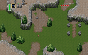
See the full demo here.
Responsive Design
The idea behind a responsive design is twofold. One, design the content so that it can be viewed by any device. This is usually achieved by using CSS and media queries to change the layout to match the viewport. Two, serve the correct resources per device so that it doesn’t use more data than needed. Serving the correct content to your users is important because bigger file sizes mean more data needed to download as well as slower download speeds.
There are many resources and techniques one can use when developing a website to make it responsive. However, these same techniques have yet to make it into the HTML5 game development world. The only issue that has been addressed is how to resize the canvas to the viewport. And even then, the solution for doing so has been to rely on JavaScript to set the width and height of the canvas when resizing.
As part of the search for a true responsive design, I wanted to try to find a pure CSS solution to a responsive canvas. For the most part what I found works, but it does have some issues in IE (go figure). Again, this was an experiment so the idea can be improved upon. Your comments and suggestions are welcome, just post them in the comments or send me an email.
To start off our responsive design, we’ll begin with resizing the canvas.
Using CSS to Resize the Canvas
Resizing the canvas using CSS is actually quite easy, and it will still maintain the correct aspect ratio for your game. The idea was to center the game in the middle of the screen, both horizontally and vertically (the problem with IE). Once the content is centered, CSS does the rest to keep the aspect ratio the same.
First, we’ll start with the HTML. Because centering something vertically is pretty tough (honestly, I think margin: auto 0; should work just like it does for horizontal centering, but whatever), we’ll have to use three divs.
<div class="wrapper">

  <div class="container">

    <div class="canvas-container">

      <canvas id="main" width="1024" height="640"></canvas>

    </div>

  </div>

</div>
With the HTML in place, we’ll use CSS to center it. The CSS uses display: table to vertically align an element with a flexible height. The CSS will also set the min and the max width of the canvas. This will ensure that the game doesn’t shrink too small that it becomes unplayable and doesn’t grow too large so that it still fits nicely on a desktop screen.
.wrapper {

   display: table;

   padding: 0;

   width: 100%;

   height: 100%;

   position: absolute;

}
.container {

   display: table-cell;

   vertical-align: middle;

}
.canvas-container {

   position: relative;

   max-width: 1024px;

   min-width: 320px;

   margin: 0 auto;

}
#main {

   width: 100%;

   height: auto;

   background-color: pink;

}
By setting the canvas element to have 100% width and have height as auto, it will maintain the aspect ratio you set. This is essentially all you need to have the canvas respond to the size of the viewport.
Now the only problem is that IE10 does not set the height of the .canvas-container to fill the full height of its parent, but instead sets the height to the smallest it can. The width remains correct, so the effect is a vertically squished canvas. I’ve tried getting it to work in IE, but have had no luck. Again, if you have any suggestions for improving the code to work as a pure CSS solution, please let me know.
Serving the Right Resources
With the canvas being able to respond to the viewport, we still need to be able to serve the correct size images of our game to the user. To do this, we’ll use the same technique described by Les James. If you haven’t yet, I encourage you to read his article as I’ll be borrowing directly from his technique.
His idea was to use CSS media queries to set the content of the body to a JSON string that would hold the current size of the viewport (small, medium, large), and an array of sizes that were acceptable to use if the current size does not have an image. He then sets a data attribute for each image corresponding to each size (data-small, data-medium, data-large) which holds the URL to the image of that size. Lastly, he uses JavaScript to detect resize events and to set the src attribute of the image to the current size found in the JSON string.
Of course, this is not the only way to program responsive images, there is no correct or right way as of now to have an image be responsive. This is just one way that I particularly liked, but for your game you can use any technique speaks most to you.
To begin, lets start with the CSS.
/* Mobile */

body::before {

  display: none;

  content: '{ "current": "small", "all": ["small"] }';

}
/* Tablet */

@media (min-width: 480px) {

  body::before {

    content: '{ "current": "medium", "all": ["small", "medium"] }'

  }

}
/* Desktop */

@media (min-width: 640px) {

   body::before {

    content: '{ "current": "large", "all": ["small", "medium", "large"] }'

  }

}
The size breakpoints of when to change from one size to another can be different for each game. I used these sizes because 480px is the size of my iPod touch viewscreen when flipped on its side, so I want to serve small images up to that size. But each can be tailored to your game.
Next we’ll create the images for our game and set their data attributes.
canvas = document.getElementById('main');

ctx = canvas.getContext('2d');

previousSize = {width: canvas.width, height: canvas.height};
imageLoader = new function() {

   this.background = new Image();
   // http://lunar.lostgarden.com/uploaded_images/ExteriorTest-760306.jpg

   this.background.setAttribute('data-small', 'http://sklambert.com/php/phpThumb/phpThumb.php?src=test.png&w=240');

   this.background.setAttribute('data-medium', 'http://sklambert.com/php/phpThumb/phpThumb.php?src=test.png&w=336');

   this.background.setAttribute('data-large', 'http://sklambert.com/php/phpThumb/phpThumb.php?src=test.png&w=512');
   this.backgroundSprite.onload = function() {

     previousSize = {width: canvas.width, height: canvas.height};

     canvas.width = imageLoader.background.width;

     canvas.height = imageLoader.background.height;

     ctx.drawImage(imageLoader.background, 0, 0);

  }
Inside the imageLoader object we will create all the images for our game, set their attributes to the URL of the image of that size, and create an onload event that will get fired each time the image switches src‘s. The function should set the height and width of the canvas to match the image, or else the image will still try to be drawn on a canvas either too big or too small for it to fit perfectly.
The previousSize object keeps track of the previous height and width of the canvas so that we can do calculations on objects drawn to the canvas. This will help us get the new x an y coordinates of things when shifting canvas sizes. If you didn’t adjust the x and y coordinates of what you were drawing when changing the height and width of the canvas, you wouldn’t be able to keep them in the same spot when the size changed.
To help serve the images of different sizes, I’m using a program called phpThumb. It’s a nice little program that will serve one image in multiple sizes just by using parameters on the URL. It’s quite helpful so I didn’t have to create multiple images for this technique.
Lastly, we’ll create the JavaScript to change the src attribute of all images in the imageLoader object when a new image size is needed.
// Code by Les James

function removeQuotes(string) {

   if (typeof string === 'string' || string instanceof String) {

      string = string.replace(/^['"]+|\s+|\\|(;\s?})+|['"]$/g, ");

   }

   return string;

}
function getBreakpoint() {

   var style = null;

   if ( window.getComputedStyle && window.getComputedStyle(document.body, '::before') ) {

      style = window.getComputedStyle(document.body, '::before');

      style = style.content;

   }

   return JSON.parse( removeQuotes(style) );

}
function setSource() {

   label = getBreakpoint();

   for (i in imageLoader) {

      var source = imageLoader[i].getAttribute('data-' + label.current);

      if (source != imageLoader[i].src) {

         imageLoader[i].src = source;

      }

   }

}
document.addEventListener("DOMContentLoaded", setSource);

window.onresize = setSource;
Drawing to the Canvas
If you want to draw something to the canvas, you will have to change its x and y coordinates to draw to the correct position on the new canvas size. To do this, just divide the current size of the canvas by the previous size of the canvas, and multiple your x and y coordinates by this number. This will transform the coordinates both directions (shrinking or growing).
var xRatio = canvas.width / previousSize.width;

var yRatio = canvas.width / previousSize.width;
obj.x *= xRatio;

obj.y *= yRatio;

ctx.drawImage(image, obj.x, obj.y);
If the image can move, you’ll also need to change the speed at which it can move by the same ratio, otherwise it will move faster when small and slower when large.
Conclusion
This technique has taken me a month to complete and finalize to be able to release to the HTML5 gaming world. I hope that you have found it useful and that it can be expanded upon to create some truly responsive HTML5 canvas games.