Chronos Post Mortem

Chronos is my first published game that was made for the Clay.io student “Got Game?” competition. The game was developed in only one month with me as the sole developer and artist. In this article I’ll discuss what went well with the game and what didn’t go so well.
Play the Game
Chronos is a sci-fi turn-based strategy combat game. It was inspired by the Heroes of Might and Magic battle system and other games like Hero Academy and the popular tabletop game Warhammer 40k. You and an opponent both pick armies and battle against one another till the last man standing.
The Gameplay
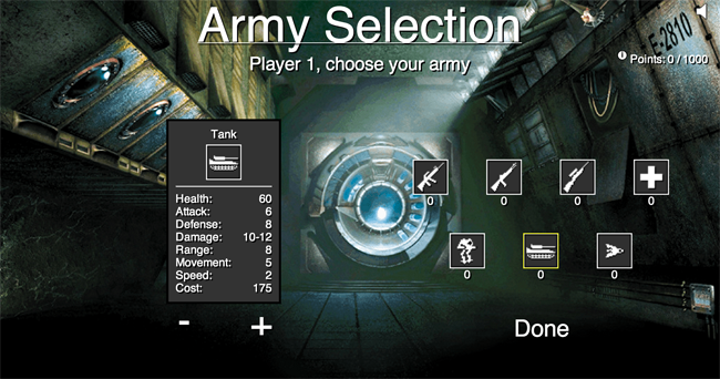
Before you start the game, each player must first build their armies by choosing from available units. Each unit has seven stats: health, attack, defense, damage, range, movement, and speed. If a units health goes to zero, the units dies and is removed from the game. The units will attack other units and damage them based on their Damage state range, which is modified either up or down slightly depending on the Attack and Defense stat. Higher Attack means you deal more damage while higher Defense means you take less damage.
Range determines how far the unit can attack and Movement determines how far the unit can move. The last stat, Speed, determines how quickly the units activate. A higher speed means the unit goes ahead of units with lower speeds.
The combination of these stats add up to give a cost to the unit, or how much it is to add the unit to your army. Each player has a total of 1000 points to pick and choose their units.

There are seven units to the game: Marine, Shotgun Trooper, Sniper, Medic, Mech Unit, Tank, and Corvette. The units vary in size and shape, adding to the strategy of unit placement. A lot of the strategy for the game comes for choosing the right unit composition to defeat your opponent.
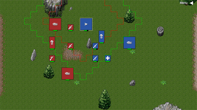
After the armies are selected, the players then go into the battle, taking turns, moving their units, and trying to destroy the opposing player.

The Art
Initially, I wanted to have each unit drawn up and use sprite sheets to have them move, attack, and receive damage. One week into the project I was able to find an artist to create all the images for me since I am no artist. With one week left to finish the game, the artist bailed on me, leaving me with no unit art!
I had to spend about a full days time trying to come up with an alternative art style that would still look decent. I decided to go with the unit icons that are now in the game because they were super simple to make. I’m happy with how they turned out, but I hope I can find an artist in the future who could do the units and sprite sheets.
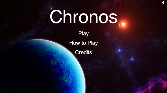
All the images for the games menus were taken from open source sites, mostly OpenGameArt.org. This was a huge lifesaver for me and made the game seem really polished. The tileset really doesn’t fit well with the overall theme I was aiming for (futuristic sci-fi), but it was the best I could find on such short notice.
The Audio
I found the audio for the game on OpenGameArt.org. I really like how it feels and I think it works well for the menus. However, I don’t think it works well for the battle system. If I had more time, I think I would have found a different soundtrack to play during the combat to help make it more upbeat. Sound effects for moving and attacking would have also been nice if the time allowed. Overall though, I like how it turned out.
The Development
Before I began coding the game, I developed the game on a piece of paper and used wooden pieces as the units. I believe doing this really helped jump-start the game as I was able to get something playable within a few hours of coming up with the original idea. I got a few friends to help me play test the game at this stage, and they gave me some great feedback on the feel and balance of the game mechanics. I also created a simple program that would take two units and have them fight against each other. This helped me to see the result of different stat changes as well as get an overall feel for how much each stat should be worth. Once I felt comfortable with the game mechanics, I began to code the game.
I developed the game using the Impact JS Game Engine. It was provided free to any students participating in the competition (quite nice actually). It was the first time I had used Impact, so it took me some time to get use to how it did things. Even then, there were some things that caused errors that I could never explain, so it took me longer than I wanted to adjust to it.
Once I did adjust to it though, it was very nice to work with. I was able to create the level in just a matter of minutes, and adding a new unit to the game took about one minute. The longest development time was spent getting the movement and attack ranges outlined and working how I wanted them to. I spent a great deal of time trying to design an intuitive way to show players both their movement and attack range at the same time. I think the current implementation does just that.
One thing I didn’t like about the game engine was that it forced me to draw everything to the canvas every frame. Since the game is static and doesn’t have any moving pieces, it could have been drawn only once until a new unit activated. Instead, everything had to be drawn to canvas every frame. The game still played at good frame rates, but I think its a bit wasteful for my type of game. Also, I feel that the documentation for the game engine is a bit lacking and forced me to dig around the internet for simple questions.
The menu system was developed entirely using CSS, HTML, and JQuery. This made it really simple to get the look and feel I wanted for each screen and use event handlers to do all the hard work for me. I personally feel that if you are making a game for HTML5, the menu system should be done using CSS instead of being drawn on the canvas.
The Competition
About 70 games were submitted for the competition. I’ve noticed that most of the games are platformers, puzzle, or shooters. These types of games are also the ones that seem to be doing well in terms of user ranking and number of plays. Looking back, I think my game was designed for a different type of audience causing most players to overlook it or not like it. Bad reviews don’t bug me, but what was kind of annoying is that users would give the game a bad ranking without telling me why. I would really like good feedback on how to improve the game, but no one seems to want to give me that feedback. Oh well.
There is still another week left in the competition and I doubt I will do well. But doing well was never the purpose of the game (nor of the competition). I finally released a game after a year of learning about game development! Not too shabby if I do say so myself. I’m proud of my game.
The Future
Now that the competition is over, I plan on continuing to develop the game. I have 6 more races planned that I would like to add to the game at some point. I would also love to add unit images and sprite sheets and a new tileset to make the game have a more visual appeal. Doing so would also unify the game better.
I also would like to make the game playable on handheld devices. As it stands, the game plays at only one resolution, so it makes it almost impossible to play the game on a handheld device. Impact makes it pretty easy to serve different game sizes to different media devices, but my code structure for the game would have to change a bit to accommodate doing so.
Overall, I think the game was a huge success and it taught me a great deal about game development and myself. I can’t wait to get programming on improvements for this game as well as starting a new one.
